
Beautiful Site Design Tips for a Spa Website
If you’re interested in having your website match the beauty of your spa, check out this article for the best site design tips to implement in your spa website.
Are you planning an overhaul of your current spa website? Or are you designing one from scratch?
In either case, the way you design your site could make or break your business. In fact, a staggering 94% of people place more importance on the way a site looks rather than what it contains.
With that sobering fact in mind, how can you ensure your site design will attract people to your spa?
Here are our six best site design tips to create a beautiful website for your spa.
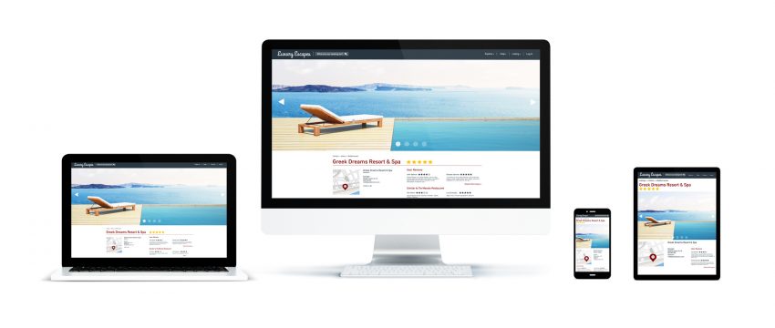
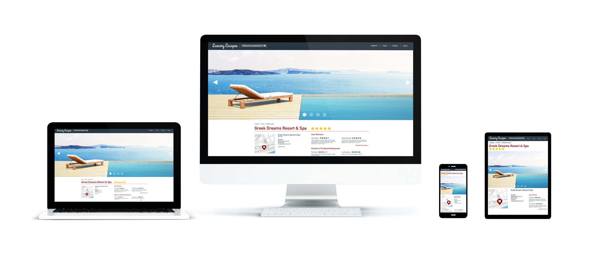
1. Opt for Mobile-Friendly
The results are in: More people will view your site on a mobile device than on a desktop computer.
What does this mean for your business? There’s nothing wrong with a website that looks great on a classic desktop screen. In fact, yours absolutely should.
But if your site doesn’t also look great on a mobile phone or tablet, you could be driving potential clients to your competitors. Make sure you hook both desktop and mobile visitors by choosing a responsive site design for all devices.
2. Think Minimalist
It’s tempting to fill your website with bold colors, dazzling graphics, background music, entertaining GIFs, and other bells and whistles.
Don’t.
While you definitely want your spa’s site to be attractive, it’s possible to overdo it on site design. This is especially true on your homepage, where you have less than eight seconds to grab (and keep) a visitor’s attention.
To do this, your homepage and the rest of your site should be free of clutter. No one will read every word on the page anyway, so limit your text only to what’s most important.
Whenever possible, use images and icons to communicate your point. The less someone has to scroll through, click through, and remember, the more inclined they’ll be to linger on your site.
3. Create Visual Hierarchy
Continuing from the previous point, a crucial aspect of site design is creating a clear visual hierarchy.
What’s the first thing you want your visitors to notice when they land on your site? They shouldn’t have to search for it–it should be evident in the first second.
From there, you should create a “trail of breadcrumbs” that naturally leads them through the rest of your site. They shouldn’t be scratching their heads trying to figure out where your price list is or how many spa services you offer.
All of that information should be organized clearly and in order of importance. Break text into easily digestible pieces with well-placed headers and images. Use color, contrast, spacing, and size for emphasis and ensure your visitors notice what you want them to notice.
Be conscious of which elements are drawing the most attention on each page. If it’s not the information you’re aiming for, it’s time to tweak your site design.
4. Make Navigation a Cinch
Feel free to experiment with colors, fonts, and graphics, but not site navigation.
You don’t want your visitors to go on a wild goose chase across every page of your website. Instead, aim for navigation that’s logical and easy to use. This will please your visitors and will also score you points on search engine rankings.
Here are a few helpful navigation tips to keep in mind:
- Your logo should always link back to your homepage.
- Your menu should be at the top of each page and ranked in order of importance.
- If your site design includes long scrolling, consider vertical navigation.
- Include all important links and social media icons in your footer.
- Include a link to your contact info on every page.
The easier it is to navigate your site, the better your chances of attracting new clients to your spa. This ensures you’ll have the cash flow needed for that new Tiger River spa heater — or anything else you need for your business.
5. Fonts Matter
With an endless variety of fonts to choose from, how do you know which is best for your site? Should you mix and match several different ones?
Like other design elements, it’s easy to overdo it with fonts. Flowy script fonts may make for beautiful headers, but you don’t want to fill your entire site with it. They’re simply too hard to read for any length of time.
Along the same lines, too many different fonts look cluttered instead of classy. If you do want to include two (no more than three) fonts, make sure the end result looks harmonious instead of disjointed.
Another factor to consider? Font size.
In the olden days of the internet, it was common to see size 12 font everywhere. This is far too small for most readers today. Aim for size 16 font (or bigger) to make your site easy on visitors’ eyes.
6. Choose the Right Color Scheme
A final consideration for your spa’s site design is which color scheme to use. You may have your personal favorites, but are they the right color for a spa website?
Remember that different colors are associated with different emotions. Bold colors like red, orange, and yellow may be great for a new restaurant but are likely too “energetic” for a spa.
Instead, opt for colors that relate to nature, harmony, balance, and relaxation. These include shades of green, blue, gray, and neutral tones.
Final Thoughts on Site Design
Whether you’re doing an overhaul of your current site or designing a new site from scratch, these site design tips are sure to produce the results you want.
Once your shiny new website is live, it’s time to share it with the world!
Click here to learn more about the submission process at PageCrush. We help to get your website in front of more eyes.
You can also contact us with any questions or concerns.