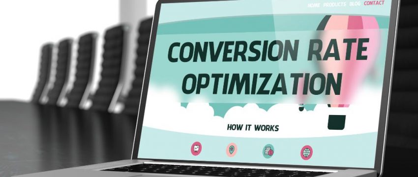
If you’re looking for a way to boost your web site conversions then check out these eight handy design tips. Trust us, you’ll be glad you took action on this advice.
The way you put your website together can make a world of difference to your website conversions.
There are some practical and simple web design tips you can follow to get the most out of your business website.
Below, we’ve set out 8 critical things you must know. Think of it as a ‘web design 101’ course.
These tips should help you to make sure your web design elements are actively supporting a fantastic conversion rate.
Keep on reading to learn more!
1. Speed
Your site must be as fast as lightning – in its search results pages; Google punishes sites which have slow load times.
But that’s only half the problem. Users also have very short attention spans when browsing the web.
So think about keeping things light – optimizing picture sizes, giving priority to practical web design elements and testing until you’ve got a site which zips along without issues.
2. Keep Choice to a Minimum
Hick’s Law states that the more choices you offer someone, the more time they’ll spend making a decision – up to a point.
You don’t want people to delay. The longer they delay, the higher the chance of them just giving up and closing the tab altogether. Remember those short attention spans!
In web design, this is really important. The most important thing to do is to lay out an obvious path for users to follow while keeping decision-making to a minimum. If you’re not sure how to this yourself, use services like DesignQuote to find specialist help.
3. Use the Rule of Thirds for Layouts
Here’s one for the creatives among us. The ‘Rule of Thirds’ is a principle in photography where the image is visualized as being divided into nine equal squares, forming a larger shape.
The points at the center of the image where the outlines of these squares intersect are where the eye will be drawn to.
Use the same principle when deciding on the layout for your site. Place points of interest like call-to-action buttons on these points. Or use the rule to highlight key information that you want customers to see.
4. Remember to Take Emails
Getting customers’ email addresses and consent to mail them is super helpful.
Always include a prominent – but not overly intrusive – form on your site, along with a few reasons to sign up to your mailing list.
The promise of incentives such as discounts or freebies might do the trick. Though this is a trust relationship, so don’t promise anything you know you’re not going to give them!
Even if they don’t buy something today, some of these people will convert in the future after you mail them.
5. Think About White Space
‘White’ space, or ‘negative’ space, is empty space. There’s nothing there, bar perhaps the background color.
This is just as important as what is there.
We’ve all visited websites in the past which have included so much on every page that trying to navigate is like wading through tar.
Allow your copy and visuals space to breathe, by making good use of the white space which surrounds them. Break up walls of text, and edit them down into more manageable chunks. Limit menu sizes (also see point 2) and space everything out nicely.
Otherwise, your users are not all that likely to stick around to convert.
6. Think Beyond ‘F’
The human eye tends to follow a predictable pattern when reading web content, in the shape of a capital ‘F’. This isn’t ideal for anyone looking to do something different, as there’s the risk users won’t find what they need, get bored, and leave.
But this isn’t the only scanning pattern of the eye online, and good design can actually encourage users to follow a different path around the site.
Generally, it’s intensive user testing that will show whether your approach is working or not. Never forget to test your site before launch or re-launch, as no matter how great something looks, it also needs to function.
The title of many designers’ favorite book sets out the focus clearly – ‘Are you communicating, or just making pretty shapes?’ If you can’t honestly say you’re communicating, you’re not helping to increase website conversions.
7. Think About Accessibility
Some of your customers will have visual problems. They might have a condition relating to their sight, such as blindness, partial sight, or color blindness.
You need to take these people into account when designing websites.
It’s not just about doing the right thing. If you don’t take an inclusive attitude in your design, you’re potentially missing out on a whole swathe of the market. They will inevitably turn to a competitor whose website they can use properly.
Tools like the Web Accessibility Evaluation Tool (WAVE) can help you to see where your website isn’t meeting these people’s needs.
By solving problems like color contrast issues, you’re helping colorblind customers to see the path you’ve set and ultimately convert.
8. Use Great Visuals
Never forget to use fantastic visuals to attract attention. Without a lasting first impression, how do you expect users to go on to convert?
There are millions of websites out there, and yours needs to do something different to stimulate users’ appetites for your product.
Quirky or unique visuals are a great way to do this.
Remember, amazing visuals should not come at the expense of page speed. So optimize your image sizes to keep load time down.
Improving Your Website Conversions
Increasing website conversions is a game of constant refinement.
You need to be improving your site over time, keeping it up to date with the latest search engine rankings criteria, as well as thinking about your users every step of the way.
It’s not easy!
That’s why you should take the time to follow our site, and keep up to date with the best new websites online, to inspire your own site’s direction.