Areas of Interest: Blog

Home Items for “Blog” (Page 2)
Finding the Right Website Development Company

8 Tips for Finding the Right Website Development Company

Comments off

Finding the right website development company for your business doesn’t have to be overwhelming.

Web sites can be fantastic tools for marketing your business. But if you decide to work with a website development company that isn’t a good match for you, it can be a real drag. Purchasing a website can be challenging. Often because you don’t know what you should be looking for and what questions to ask.

So to give you a leg up, here are some tips to help you choose the best website development company for your business.

1.Website Development Company: Established?

Experience is always a good thing for a website development company to have under its belt. You can measure this in the number of clients, years and primarily through the quality of their portfolio. These three qualities tell you valuable information.

For example, years in the industry lets you know this company is a consistent and successful enterprise and that’ll be able to work well with your business longterm. The amount of previous and current clients shows that a company knows how to deal with many different web projects. It also means its less likely they’ll work on a project they don’t have any experience in.

Lastly, it shows the company has chances to work out its kinks and experienced with deadlines and timelines.

Some questions to ask:

How much time has the company spent building and developing websites?

How many clients do they work with currently?

How many employees work for them?

To save time and money, a part of you might want to get your website up and running by a friend, freelancer or small company. Usually, the little web developers and freelancers don’t have the experience needed and what may have appeared as a money saver turns into a costly nightmare. These stories pop up over and over again and going with freelancers, and smaller companies are just a quick fix for something that needs a long-term solution.

Websites tend to need on-going work and partnering with reliable web developers helps you get the job done and then some down the road. That they have the experience, you need to guide and advise you.

2. Payment

Websites prices are at all different levels. You could get one for just about nothing and pay for hosting. The rates can also be as high as 30,000 and even higher.

The exciting thing about the web design business in that a quote for a typical website project could be different depending on the company quoting you. You might be tempted to go with the lowest price and can purchase a website between $400-$700. But it always good to fully understand what you’re paying for before the website development company gets started.

Cheaper can and tends to have limitations. Another thing to think about is that they can be out of the box solutions and won’t be able to receive the same kind of customization and consultation many websites need. The cheap option could still work, but not for everyone.

The old saying “you get what you paid for” is as true in the web design business as it is out in the world. However, like the cheap option, on the other end of the spectrum, the website can cost too much. Then the amount you paid for it doesn’t equal the expertise or quality of the final product.

The ideal way to look at a website is to it as a long-term investment. If you save a little extra money and pick the right web design company your site can be a powerful tool for years to come.

3. Updating The Website Yourself

The best way to update your website yourself is to use CMS or other content management system. Regardless of how its getting updated, that step is crucial. Because if your site isn’t on CMS, it could cost you a lot more in the future.

4. Support

Does the web design company provide ongoing support? Buying a website means maintenance will be needed. So make sure to hire a company that is willing and able to provide that.

We often hear horror stories of web development companies that start out high, but within 6-12 months and then start to lose interest. So make sure the support is ready to go when you go to hire.

5. One Place

It’s easier and better if one company takes care of everything when it comes to your website.

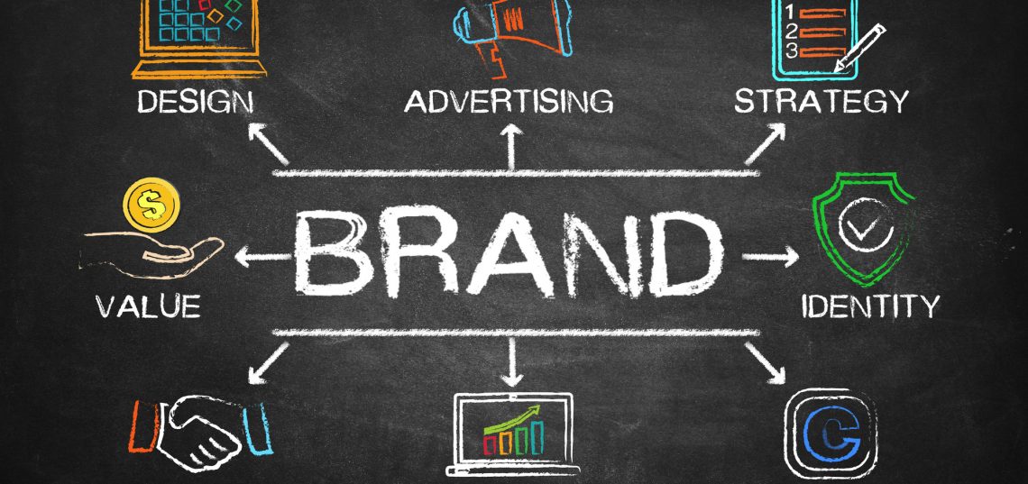
That said, there are a lot of elements that are required to make a website work. Copywriting, graphic design, hosting, support, online marketing and domain names. A company that provides all those services is one you want to go after and most of their services to promote your business.

6. Additional Charges

When you are getting quotes and buying a website, you’ll get a fixed rate, but be aware of any related sites costs and ongoing charges. A great example is supporting fees and hosting. But future expenses such as design and development costs are also reasonable to know. This allows you to get the full picture and price right up front.

7. Work Samples

It’s crucial before you hire a web development company that you see what they’ve done in the past. Don’t check out the look of the website though; the functionality is as necessary. Case studies and testimonials are also good ways to check a company’s reliability.

8. Keep Australian

In the web design business, its tempting to outsource support and development across the globe to save money and resources. But this comes at the cost of consistent communications. However, if you go with Australian business, they’ll not only be in the same timezone, but problems will get solved faster.

In general, working with a web development company in the same timezone and country helps keep the ball rolling.

Find One!

Finding a decent web design business to work with is challenging. There are a lot of factors to consider when picking one. But once you get that company that works for you, so many doors open.

For more information, check out our great way to make a high-quality website.

Trends for 2018 word in laptop computer screen with tablet on wood stood table in at window with blur background,Digital Business or marketing trending

The Top 2018 Web Design Trends to Try

Comments off

Make sure that your website design is keeping up with the competition and check out this list of the top 2018 web design trends you should be using!

To stay one step ahead of your business competitors, it’s important to keep your finger on the pulse of what’s trending in web design. After all, your company’s website is often the first thing that consumers see which represents you.

And not only is an attractive website a compelling form of branding, it also affects numerous other factors in your business’ success, including SEO efficacy, and gaining the trust of a client base.

So, are you wondering how to keep up with the latest trends to ensure that your web design is as effective as possible?

Keep reading. We’re going to break down the top 2018 web design trends to keep you in the know and ahead of your competition.

2018 web design trendsAnimations

Animations exist in web design to make stories, ideas, and products easier for consumers to understand. But, until now, they’ve been largely underutilized. For this reason, it’s no surprise that they’re a huge part of the latest 2018 web design trends.

After all, the modern attention span seems to be getting shorter and shorter. And in a world when everyone only has a moment to check out a new business or product, companies must do everything in their power to take advantage of quick and easy communication.

Incorporating short, sweet animations into your business’ web design is a great way to stay ahead of the pack.

Razor-Sharp Gradients

Over the years, designers and graphic artists have been striving for the smoothest color gradients possible. But now, the opposite look is gaining traction.

As a part of the bigger, bolder color designs we’re seeing in 2018, businesses are trying super sharp gradients on for size. These stark color differences and knife-edged lines are more visually interesting than their smooth, gradual predecessor.

Unique Grid Layouts

The unique design of grid underlays is a trend that is most certainly continuing into 2018 and developing further. Atypical, broken grids are going to start popping up more prevalently, due to designers striving to push the envelope and present something fresh and new.

No More Pop-Ups

As with many shifts in web design trends, this one is happening largely thanks to some changes that Google is making. They recently declared that they will begin to penalize sites which use pop-ups as an advertising tactic by lowering their search result ranking.

So, if you still use pop-ups, make sure to get rid of them as soon as possible. Not only will this prevent your website from being punished by search engines, it will also make your entire business look more professional and trustworthy.

Bolder and Brighter Color Schemes

What better way is there to make your brand stand out than with bright, bold color schemes? Muted colors are being left in 2017 in exchange for this eye-catching alternative.

Even if you feel that this type of design choice may be off-brand for your business, try incorporating some pops of color into your website. This will attract the consumer’s eye. It will also communicate to them where their attention should be while scrolling through your site.

Connected Storytelling

Storytelling should be at the heart and soul of your website’s design. But, ask yourself, is your storytelling truly captivating? Is it interactive?

Although this concept goes hand-in-hand with the animation trend, it’s much more than that. It could mean auto-scrolling photos with text, videos, or any other way to get your consumer base viewing, reading, and clicking.

By making sure your business’ and products’ stories are simple yet gripping, and truly interactive, you’ll put yourself miles ahead of the competition.

A New Take on Typography

Typography is an intensely powerful tool that can instantly capture the attention of a potential customer. Picture yourself clicking on a website out of interest or curiosity about the owner’s services. If you see descriptions in the same font you used for your middle school history reports, you’re going to lose interest immediately, right?

Of course. Make sure that you aren’t forgetting to consider typography in your website’s design.

And as far as 2018 web design trends go, the bigger and bolder the type, the better. This year, it’s all about grabbing consumers’ attention with a stronghold and not letting go.

Stepping Up the AI Game

Wondering what artificial intelligence has to do with 2018 web design trends? Well, it may surprise you to hear that AI is already a huge part of web design at large.

One great example is chatbots or “conversational interfaces”. These are smart, auto-responsive bots that communicate with customers via chat boxes.

Often times, the average consumer may not even realize that they have interacted with one of these artificial entities. And currently, that’s the goal.

Aim to make your AI tech a seamless, smooth experience for your consumers. This way, you’ll be harnessing a powerful current trend and setting yourself apart from the crowd.

How to Implement 2018 Web Design Trends

So, how can you successfully incorporate these trends into your business’ website? It’s simple.

First off, make sure that you’re consistently keeping your finger on the pulse. Check out a website watchlist to see what’s working for other company’s sites and what aspects you can use for your own. Others’ successes are a simple indication of what is trending at the moment.

Also, keep in mind that your website’s design should be in the hands of trusted professionals for the best results. There are tons of businesses out there, like Digalitics Technical, that exist to create a beautiful web design for you, without you needing to lift a finger.

Wrapping Up

As you can see, 2018 is bringing some bold web design choices for consumers to enjoy. By staying on top of these 2018 web design trends and how they evolve, you can be sure that you are delivering the best and latest modern technology and designs to your customer base.

This will build trust, prevent you from being negatively penalized by search engines, and give your business a modern, sleek, and competitive edge. And, of course, all of these efforts will boost your sales!

Want to know more, or have any questions? Feel free to contact us anytime. We’re here to help!

simple pleasing website layout for customers

7 Tips to Make Your Site Layout Simple but Still Pleasing to Your Customer

Comments off

Creating a website can be a daunting task, but with these 7 tips you will be on your way to making a layout that will stand out to your customers!

Your site design is about more than just giving your visitors a pretty website to explore. It’s your digital first date, and aesthetics are more important than you might think.

If provided 15 minutes to consume content, two-thirds of people prefer a beautifully-designed site over a plain one. Just don’t go overboard–39% of people will stop engaging with a site if it takes too long to load.

The key to balancing the two is simple but beautiful web design. Keep reading for our seven tips on how to revamp your site.

1. Use Intuitive Navigation

But wait, you say, my website already is intuitive!

Well, yes, it is intuitive. For your designer, but not necessarily for your visitors. Every site seems intuitive to the person who made it.

How do you fix this problem? Know thy user. Specifically, know thy user using these two methods:

  1. Field studies
  2. Over-the-shoulder usability tests

Field study means the same thing it meant in high school biology: observing your users in their natural habitat. Over-the-shoulder usability tests involve getting participants to use the site and having them comment on their thought processes out loud.

In both cases, you’re going to quietly sit back and take notes based on what you see and hear.

In intuitive web design, your site is bridging the gap between what the user already knows and the information they’re seeking so well that the user isn’t even aware of it.

Beyond studies and tests, the easiest way to move your site toward intuitive navigation is to simplify your navigation options, group things in a way that makes so much sense a drunk monkey could figure it out and put them somewhere easy for the visitor to access.

2. Ditch the Slideshow/Carousel

When the slideshow first came on the scene, it made a lot of sense as a way to show your visitors a lot of information without taking up too much space.

These days, it’s driving web surfers nuts with overuse.

The truth is, most visitors don’t stay on your site long enough to see all the slides, or they’ll just click ahead until they find the slide they want.

If this is the page your potential customers land on before anything else, then you don’t need to bombard them with information. Just give the single most important piece of information you’d want them to have if they bounced off your site after 30 seconds.

3. Lose the Sidebars (and Bury Social Icons)

It might seem counterintuitive to limit your users’ options until you remember why you’re doing this: the average web surfer has a short attention span.

Think of it this way. You went to a lot of trouble to get a visitor to your site on this specific page. Why are you driving them away once they get there?

Once you remove your sidebars, your user doesn’t have anything to pay attention to except the content itself. Same story with social icons.

If you feel like you really can’t cut the sidebars, start by dramatically simplifying them. Your user shouldn’t have to navigate a maze just to find a page via the sidebar–keep the drop-down menus simple.

4. Clear Messaging without Excessive Text

While we’re on the topic of keeping it simple, it’s time to cut all that excessive text from your site layout.

This isn’t just a good design practice–it’s also good SEO. As a rule, Google ranks long-form content better. But that doesn’t apply to all the extra words you’re cramming into your web pages outside of blog posts.

Plus, the truth is, your users just aren’t going to read all those extra words.

Cut it down to the only text that’s important. Your users (and your Google ranking) will thank you.

5. On-Brand Graphics

You should have graphics, and not just because they’re pretty: the brain processes visual information faster than words.

Use this to your advantage. We’re talking photos, infographics, charts, illustrations, the whole works.

A word to the wise, though: these images won’t help you if they aren’t on-brand. Invest the time in making quality graphics that reflect your brand.

6. Keep the Sitemap Sensible

This one is for Google, but it’s still a good practice to keep in mind when doing your site layout.

Your sitemap is a file where you list the pages on your site in order to tell Google and other search engines how your website is laid out. This allows web crawlers to index your site more efficiently (in plain English: it helps you rank higher).

You need a sitemap if any of the following apply:

  • Your site has a large archive of isolated pages
  • Your site is large in general
  • Your site is new and doesn’t have many external links
  • Your site uses rich media content

If you’re not sure where to find out more about sitemaps, Slickplan offers a free sitemap generator.

7. Keep Your Color Scheme Simple and On-Brand

Remember when we said your site layout is like your digital first date? Think of your colors like the flowers you give your date.

If you design your site yourself, it’s a good idea to start out by designing in grayscale and adding in colors one at a time later. This will keep you from going overboard by desensitization to your own site.

You should also make sure the colors you use are on-brand.

If you’re not sure what that means, think of it this way: if your logo is orange and green, you shouldn’t be using purple in every aspect of your site. Also, if your logo is tangerine orange, don’t make your site look like a paint sample–stick to the one orange and its close cousins.

Making Sense of Site Layout and Design

Need more ideas for web design and layout? We’ve got you covered.

For a look at the sites we love, check out our watchlist. If you need a creative to make your site shine, take a look at our creatives page.

If you want to promote your website on PageCrush, head over to our submissions page.

Top 8 Brand Awareness Strategy Tips

Comments off

brand awareness strategy tips

Having a solid brand awareness strategy is vital to growing your business. Read on to learn the top 8 brand awareness strategy tips.

With companies spending as much as 12% of their annual profit on marketing, there’s a lot of crowding in the field of brand awareness. Digital companies spend hundreds of thousands in storefront rent just to stay present in the mind of consumers. If you’re on a budget, you need a strong brand awareness strategy.


With more marketing moving online, the name of the game is attention. Companies need to figure out how to reward their customers for even the most meager amount of attention. In a space where consumers can see an ad from a mile away, brand awareness strategies need to stay flexible.


If you’re looking for new ways to engage your audience, a lean and versatile brand awareness strategy will find customers where they are. With so much competition, you can’t expect customers to find you. Follow these 8 tips for strong brand awareness no matter how competitive your industry.

1. Get Social

If you’re not present on every major social media site, you need to change that immediately. Customers could be finding you on Facebook, Twitter, LinkedIn, Instagram and more. Your social profile could be doing the work for you, 24/7.


A strong brand awareness strategy entails making time every day to massage your social media profiles. If your company doesn’t have a blog yet, it’s time to start one.


Creating a blog allows for other social media users to share your posts. It also allows you to get clicks on your site, building your search engine rankings.


Connecting with your audience allows you to build a community of dedicated followers online.


When they send you messages, be sure to respond quickly and you’ll build a strong reputation.

Online promotion is challenging but if you’re going to buy ads, make sure you know how to win at PPC.


2. Live Events

Holding events is a great way to build loyalty for your company. Promote your event through your social media channel and you’ll be able to attract potential clients and prospects who like what you post.


If you have a company office, invite people to check out something new you’ve just created. Come up with a themed summer barbecue or a holiday party. Everyone loves free food and drinks, so it shouldn’t be hard to get people in the door.


Line up some special speakers, put together special promotions, or run a short workshop on how to be successful with your products or services.


Giving your clients a little bit of IRL time can pay off on your digital platforms. Once they know who you are, they’ll engage with you more frequently, expanding the reach of your brand awareness.


If your company’s ethics line up with a local non-profit or charity, consider creating a fundraiser. You’ll show that you’re connected to the community while being able to promote brand awareness.

3. A Big PR Campaign

If you’ve got a great story behind why you’ve started your business, why not tell it to the world. You could be inspiring other and be promoting brand awareness.


The best way to launch a PR campaign is to find a way to make it newsworthy. If there’s a local event that just happened, find a way to bring the community together with your products and services.


Get out to local events and put up a table. Hand out free samples or just free snacks in exchange for a three questions survey about how your products can better serve your community.


Get creative and you can build better brand awareness for no cost at all.

4. Show Off Your Products

Depending on the industry you’re in, you could be holding exhibitions and product demonstrations. Even better, you could hold a competition for how to show off what your products can do.

If you have something that could be incorporated into a cooking contest, a pine box derby, or sports contest, take advantage of this. Get your clients together for a branded demonstration of what your products can do.


You’ll be showing off your products getting to know your biggest fans.

5. Link up with Other Businesses

There’s no better way to build a local following than to work with other local businesses. The people who support local businesses are always looking for more ways to support the local economy. Make it easier by offering your products alongside one another.


Companies that produce natural health items like lip balms and deodorants could link up with yoga studios and spas. They could offer one another’s products or vouchers for services with online orders.


Build a following with virtually no effort by creating connections to other businesses whose services complement yours.

6. Sponsor a Team

In just about every company, local kids’ sports teams are always looking for sponsors to buy their jerseys and shirts. Be one of those sponsors and reward their parents when they purchase from you during the season.


An increasing number of companies in major cities are sponsoring bike race teams and local adult softball teams. Connecting with your local teams can turn into free advertising when teams go out for drinks and dinner after a race or a game.

7. Create a Pop-up Experience

Creating a big and boisterous pop-up downtown can introduce lots of new people to your brand. You could see major returns from this brand awareness strategy and give you the opportunity to connect with dedicated clients.


You’ll show off just how great your brand is to those already converted. They’ll be even more confident in your brand and tell their friends and colleagues about you. Make it something exciting like an art exhibit or a fashion show and you’ll connect with a younger and more engaged audience.


You could find your brand all over social media the next morning if you play it right.

8. Promotional Merchandise

If you don’t have some already, you should make up lots of promotional items. You should be giving away pens, keychains, and umbrellas with your brand logo on them like there’s no tomorrow.


You should also come up with special merchandise for special events. If you’re sponsoring a 5K, splurge on water bottles so that your brand is featured in every photo people post after the race.


Spend some time putting together a great design and you’ll see plenty of rewards come back to you.

Your Brand Awareness Strategy Increases Sales

If you play your cards right, you could be able to measure your profits based on your brand awareness strategies.


Try to watch for sales increases based on each implementation so that you can see what works and what doesn’t. Once you’ve got an idea of how your strategy connects with sales, you can work your strategy to improve every quarter.


If you’re ready to take your brand awareness to the next level, contact us for how to get started with implementation.

6 Common Qualities of the Best Realtor Websites

Comments off

Common Qualities of the Best Realtor Websites

In today’s world, a great website is crucial to a realtor’s success. Check out some of the shared qualities of the best realtor websites by clicking here.

As recently as a few months ago, researchers found that nearly 50% of all small businesses still had no web presence.

Whether you’re building your first site or looking for ways to revamp your real estate site, you’re already ahead of half of your competitors. That should make it fairly easy for you to build one of the best realtor websites in your region.

As an increasing majority of people find out about businesses through their social media presence or website, there’s pressure on realtors to have great sites. If you’re new to web design, you might feel like the learning curve is beyond your capabilities.

Thankfully there are plenty of resources and services out there to help you with your site. Follow these 6 tips and you’ll be sure to have all the qualities of the best realtor websites on the internet.

1. Design Mobile First

In the last couple of years, mobile browsing has overtaken desktop browsing as the number one way people search the web. Most users will be accessing your site for the first time on a mobile device, tablet, or phone. You need to make sure that your site looks as good as possible on mobile browsers.

Search engines are also beginning to give mobile-friendly websites top priority in search results. If your website gets pushed down to the second or third entry, not to mention the second or third page of results, you’re toast in the eyes of your customers.

Start with a mobile-optimized design and run some tests on different devices. Log in on your phone and any tablets you can get your hands on. Make adjustments as necessary and make sure all of your menus work as well as they can.

Follow the three click rule. You should be able to get anywhere on your site in three clicks or less. More than that means that your site is too complicated.

2. Use Great Images

Your clients will view their time as precious and so they’ll want to know that if they schedule a viewing, they’re headed out to look at something potentially great. Don’t skimp on photos as they can be the deciding factor in selling or renting a property.

Hire a professional photographer to take professional headshots of all of your staff members too. These photos can be used on their own social media and professional profiles in order to help expand the reach of your business. Having great professional photos will win the trust of your customers.

Whenever possible, hire a photographer to go out to properties. Rather than having someone who doesn’t know what they’re doing taking photos with their phone, get the kind of photos that get a property sold or rented.

When uploading photos to your site, don’t use gigantic file sizes. Figure out what the appropriate width is for your site and resize all of your photos to that size. When a browser has to recalculate the sizes of your photo, it slows download times and can cause customers to leave your site and head to a competitor’s.

3. Target Locally

When you’re designing your website, roll up your sleeves and get into the metadata. You need to populate your titles, descriptions, and image tags with terms that will get more hits on your website.

When users search for businesses like yours on search engines, they usually use pretty general terms. Search engines go into their cookies to look and see where they’re located. That’s why local SEO is the wave of the future.

The best realtor websites include lots of mentions of what city and neighborhoods they specialize in. By including geographic locations, landmarks, and city names both in user-visible data and machine visible data, you’ll help direct searches to your site.

If you’re a Panama realtor, you need to tell people as often as possible in your URLs, titles, and page headings. Use as many specific terms as possible for the best results.

4. Include Testimonials and Reviews

The best realtor websites will include a full page of testimonials from people who’ve bought or rented from that realtor. You should have a list of some of your biggest clients raving about you with photos of the properties they’ve picked up.

You should also reach out to your previous clients and get them to write reviews for you on Zillow, Yelp, Google My Business, and every social media channel. Most will be more than happy to share some words about their positive experience with you.

All of those positive results will also help your SEO strategy and get you listed higher in user searches.

5. Create A Blog

First-time home buyers and renters of all kinds often feel overwhelmed when thinking about how to get their dream dwelling. They waste precious hours looking at places that are terrible in locations that are less than ideal. Help them save time with a blog.

Blogs are also great for your SEO. Search engines love websites that update frequently with original content. You’ll be ranked higher if you can show that you have a lot to say to your audience. You’ll also be building brand authority, which can be hugely valuable in the competitive world of real estate.

6. Integrated Analytics

The best realtor websites will be integrating analytic tools into their site. This way, they can measure every one of their social media campaigns and all of their digital strategies to see what works.

There are plenty of free analytic tools available online. They will tell you where your traffic is coming from, how long people stay on your site, and where they click to the most.

Taking advantage of these tools will help you craft the perfect site and the best web presence in your real estate market. Try a few different analytic tools to find one that fits your style.

The Best Realtor Websites Stay Up To Date

One of the most important takeaways from this list should be that your website isn’t a fixed honeypot that will generate infinite leads. It needs to be tended to and massaged. As real estate trends change in your area, you need to be adding blogs and different metadata related to those trends.

If you’re ready to build the best realty website in your market, contact us for more tips to save time and generate leads.

How to Create an Aesthetically Pleasing Website for Your Spa

Comments off

website tips for your spa

Beautiful Site Design Tips for a Spa Website

If you’re interested in having your website match the beauty of your spa, check out this article for the best site design tips to implement in your spa website.

Are you planning an overhaul of your current spa website? Or are you designing one from scratch?

In either case, the way you design your site could make or break your business. In fact, a staggering 94% of people place more importance on the way a site looks rather than what it contains.

With that sobering fact in mind, how can you ensure your site design will attract people to your spa?

Here are our six best site design tips to create a beautiful website for your spa.

1. Opt for Mobile-Friendly

The results are in: More people will view your site on a mobile device than on a desktop computer.

What does this mean for your business? There’s nothing wrong with a website that looks great on a classic desktop screen. In fact, yours absolutely should.

But if your site doesn’t also look great on a mobile phone or tablet, you could be driving potential clients to your competitors. Make sure you hook both desktop and mobile visitors by choosing a responsive site design for all devices.

2. Think Minimalist

It’s tempting to fill your website with bold colors, dazzling graphics, background music, entertaining GIFs, and other bells and whistles.

Don’t.

While you definitely want your spa’s site to be attractive, it’s possible to overdo it on site design. This is especially true on your homepage, where you have less than eight seconds to grab (and keep) a visitor’s attention.

To do this, your homepage and the rest of your site should be free of clutter. No one will read every word on the page anyway, so limit your text only to what’s most important.

Whenever possible, use images and icons to communicate your point. The less someone has to scroll through, click through, and remember, the more inclined they’ll be to linger on your site.

3. Create Visual Hierarchy

Continuing from the previous point, a crucial aspect of site design is creating a clear visual hierarchy.

What’s the first thing you want your visitors to notice when they land on your site? They shouldn’t have to search for it–it should be evident in the first second.

From there, you should create a “trail of breadcrumbs” that naturally leads them through the rest of your site. They shouldn’t be scratching their heads trying to figure out where your price list is or how many spa services you offer.

All of that information should be organized clearly and in order of importance. Break text into easily digestible pieces with well-placed headers and images. Use color, contrast, spacing, and size for emphasis and ensure your visitors notice what you want them to notice.

Be conscious of which elements are drawing the most attention on each page. If it’s not the information you’re aiming for, it’s time to tweak your site design.

4. Make Navigation a Cinch

Feel free to experiment with colors, fonts, and graphics, but not site navigation.

You don’t want your visitors to go on a wild goose chase across every page of your website. Instead, aim for navigation that’s logical and easy to use. This will please your visitors and will also score you points on search engine rankings.

Here are a few helpful navigation tips to keep in mind:

  • Your logo should always link back to your homepage.
  • Your menu should be at the top of each page and ranked in order of importance.
  • If your site design includes long scrolling, consider vertical navigation.
  • Include all important links and social media icons in your footer.
  • Include a link to your contact info on every page.

The easier it is to navigate your site, the better your chances of attracting new clients to your spa. This ensures you’ll have the cash flow needed for that new Tiger River spa heater — or anything else you need for your business.

5. Fonts Matter

With an endless variety of fonts to choose from, how do you know which is best for your site? Should you mix and match several different ones?

Like other design elements, it’s easy to overdo it with fonts. Flowy script fonts may make for beautiful headers, but you don’t want to fill your entire site with it. They’re simply too hard to read for any length of time.

Along the same lines, too many different fonts look cluttered instead of classy. If you do want to include two (no more than three) fonts, make sure the end result looks harmonious instead of disjointed.

Another factor to consider? Font size.

In the olden days of the internet, it was common to see size 12 font everywhere. This is far too small for most readers today. Aim for size 16 font (or bigger) to make your site easy on visitors’ eyes.

6. Choose the Right Color Scheme

A final consideration for your spa’s site design is which color scheme to use. You may have your personal favorites, but are they the right color for a spa website?

Remember that different colors are associated with different emotions. Bold colors like red, orange, and yellow may be great for a new restaurant but are likely too “energetic” for a spa.

Instead, opt for colors that relate to nature, harmony, balance, and relaxation. These include shades of green, blue, gray, and neutral tones.

Final Thoughts on Site Design

Whether you’re doing an overhaul of your current site or designing a new site from scratch, these site design tips are sure to produce the results you want.

Once your shiny new website is live, it’s time to share it with the world!

Click here to learn more about the submission process at PageCrush. We help to get your website in front of more eyes.

You can also contact us with any questions or concerns.

  • Page 2 of 2
  • 1
  • 2